BARS Tyres — Brand Launch Campaign
Creative Concept · Art Direction · Key Visual · Digital Activation
Digital Activation, OOH
Key-visual
Advertising campaigh
BARS is a new tyre brand entering competitive CIS and Middle Eastern markets. Despite its affordable positioning, the product meets European quality standards and strict manufacturing controls — every defective tyre is immediately recycled.
Challenge
The task for the agency was to create a strong, memorable key visual that would:
introduce the brand to a wide audience,
build instant recognition of the logo and leopard symbol,
communicate reliability and accessibility,
work across multiple formats — digital, print, POS and outdoor.
The film used to pitch the key visual concept to the client.
Behind the idea
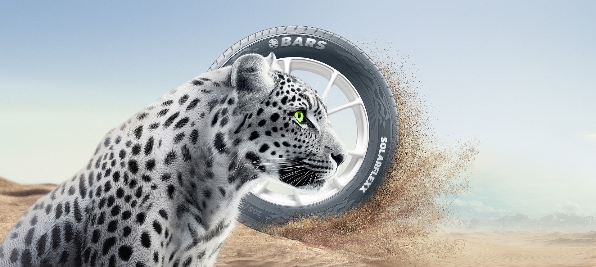
Grip first. The campaign focused on drivers in Russia and Central Asia who spend long hours on rough roads and in harsh weather. The prominent tread makes grip the focus. The SUV and flying mud establish the conditions, while the snow leopard embodies confidence on difficult terrain.
Introducing BARS.
The launch needed to connect a new name with its product. Bringing the logo, tyre and snow leopard together introduces the brand and gives its promise a visual identity.
By focusing on user-centric design and seamless integration, we delivered an enhanced commerce experience that reduced friction and empowered businesses. The streamlined interfaces and intuitive navigation fostered user engagement, while the cohesive visual language elevated Crosby's brand presence. Ultimately, our efforts led to increased client satisfaction and solidified Crosby's position as a leader in the competitive commerce industry.By focusing on user-centric design and seamless integration, we delivered an enhanced commerce experience that reduced friction and empowered businesses. The streamlined interfaces and intuitive navigation fostered user engagement, while the cohesive visual language elevated Crosby's brand presence. Ultimately, our efforts led to increased client satisfaction and solidified Crosby's position as a leader in the competitive commerce industry.
Digital Activation
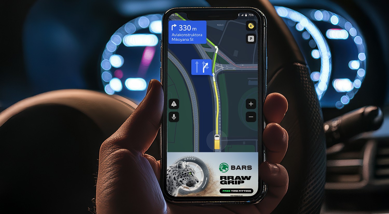
“RRAW GRIP” Geotargeted Campaign: to bring the “RRAW GRIP” concept into digital media, we developed a geo-triggered ad mechanic linked to drivers’ real behaviour.
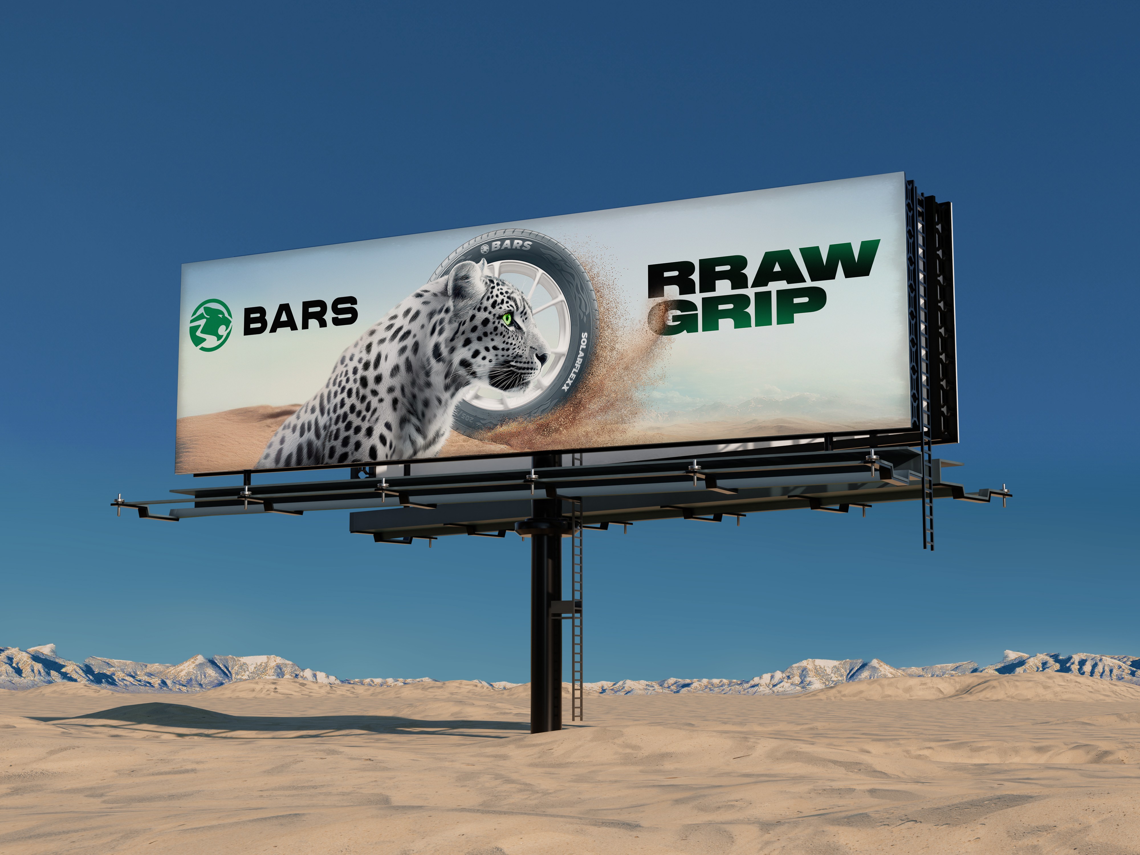
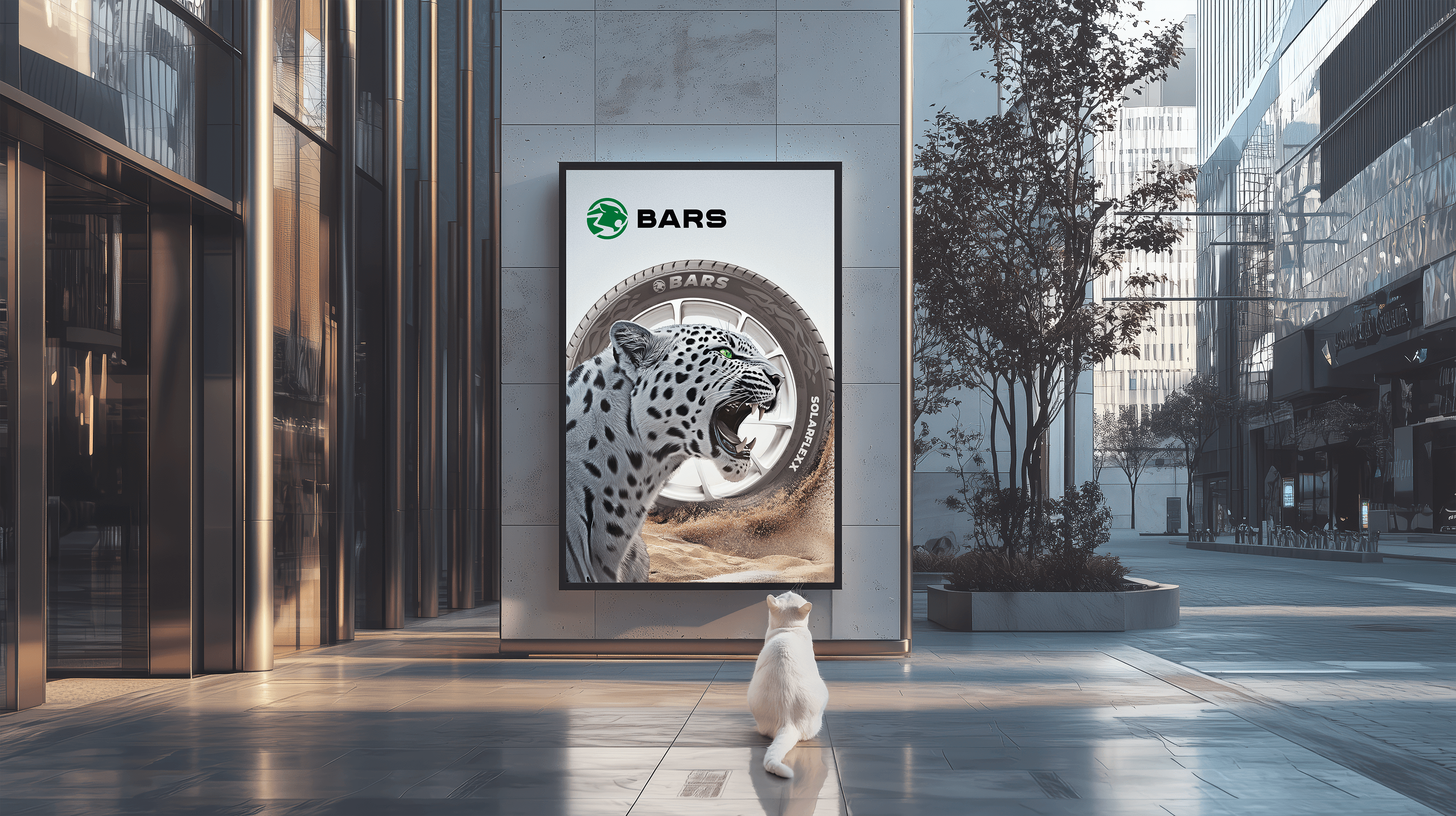
To strengthen brand recognition and visual consistency, the key visual was extended into a series of image-based posters placed near car dealerships and tyre retail points.
Each layout echoed the distinct profile shape of the BARS logo — a smooth, dynamic curve that visually connected the leopard’s head and the tyre silhouette.
This repetition of form helped to reinforce the brand’s signature look and ensure immediate recall, even from a distance.
The posters served as high-impact brand reminders, designed not to sell directly but to build familiarity and trust — establishing BARS as a confident new player in the tyre market.
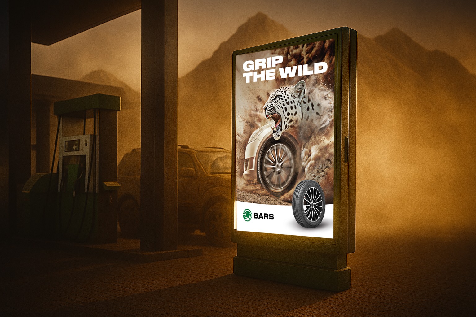
Additional slogan — “Grip the Wild”
The tagline “Grip the Wild” captures the spirit of the BARS brand — a balance between strength, instinct, and control.
It reflects the tyres’ ability to stay confident and responsive where ordinary ones lose traction.
A series of image posters with this slogan were placed at suburban gas stations and roadside stores, reminding drivers that BARS tyres are made for the untamed — ready for dirt, gravel, and every road beyond the city.

Brand Awareness Posters
Shaping identity throRetail rollout
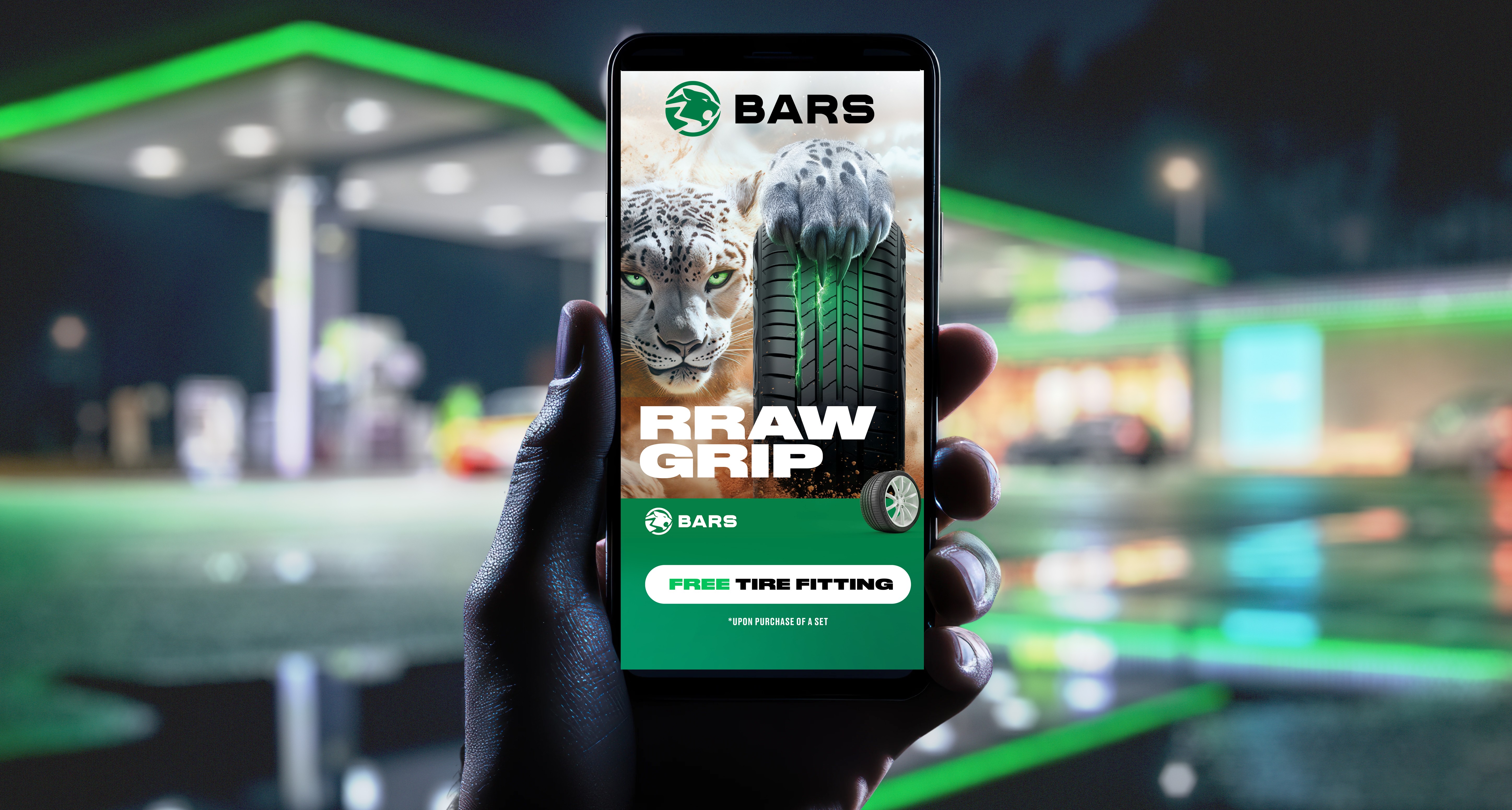
Retail partners used the key visual in their own promotional materials, combining the campaign imagery with their offers. Selected placements from the 2024 campaign are shown below.ugh form repetition
More Works
(GQ® — 02)
©2024


BARS Tyres — Brand Launch Campaign
Creative Concept · Art Direction · Key Visual · Digital Activation
Digital Activation, OOH
Key-visual
Advertising campaigh
BARS is a new tyre brand entering competitive CIS and Middle Eastern markets. Despite its affordable positioning, the product meets European quality standards and strict manufacturing controls — every defective tyre is immediately recycled.
Challenge
The task for the agency was to create a strong, memorable key visual that would:
introduce the brand to a wide audience,
build instant recognition of the logo and leopard symbol,
communicate reliability and accessibility,
work across multiple formats — digital, print, POS and outdoor.
The film used to pitch the key visual concept to the client.
Behind the idea
Grip first. The campaign focused on drivers in Russia and Central Asia who spend long hours on rough roads and in harsh weather. The prominent tread makes grip the focus. The SUV and flying mud establish the conditions, while the snow leopard embodies confidence on difficult terrain.
Introducing BARS.
The launch needed to connect a new name with its product. Bringing the logo, tyre and snow leopard together introduces the brand and gives its promise a visual identity.
By focusing on user-centric design and seamless integration, we delivered an enhanced commerce experience that reduced friction and empowered businesses. The streamlined interfaces and intuitive navigation fostered user engagement, while the cohesive visual language elevated Crosby's brand presence. Ultimately, our efforts led to increased client satisfaction and solidified Crosby's position as a leader in the competitive commerce industry.By focusing on user-centric design and seamless integration, we delivered an enhanced commerce experience that reduced friction and empowered businesses. The streamlined interfaces and intuitive navigation fostered user engagement, while the cohesive visual language elevated Crosby's brand presence. Ultimately, our efforts led to increased client satisfaction and solidified Crosby's position as a leader in the competitive commerce industry.
Digital Activation
“RRAW GRIP” Geotargeted Campaign: to bring the “RRAW GRIP” concept into digital media, we developed a geo-triggered ad mechanic linked to drivers’ real behaviour.
To strengthen brand recognition and visual consistency, the key visual was extended into a series of image-based posters placed near car dealerships and tyre retail points.
Each layout echoed the distinct profile shape of the BARS logo — a smooth, dynamic curve that visually connected the leopard’s head and the tyre silhouette.
This repetition of form helped to reinforce the brand’s signature look and ensure immediate recall, even from a distance.
The posters served as high-impact brand reminders, designed not to sell directly but to build familiarity and trust — establishing BARS as a confident new player in the tyre market.
Additional slogan — “Grip the Wild”
The tagline “Grip the Wild” captures the spirit of the BARS brand — a balance between strength, instinct, and control.
It reflects the tyres’ ability to stay confident and responsive where ordinary ones lose traction.
A series of image posters with this slogan were placed at suburban gas stations and roadside stores, reminding drivers that BARS tyres are made for the untamed — ready for dirt, gravel, and every road beyond the city.
Brand Awareness Posters
Shaping identity throRetail rollout
Retail partners used the key visual in their own promotional materials, combining the campaign imagery with their offers. Selected placements from the 2024 campaign are shown below.ugh form repetition
More Works
(GQ® — 02)
©2024
BARS Tyres — Brand Launch Campaign
Creative Concept · Art Direction · Key Visual · Digital Activation
Digital Activation, OOH
Key-visual
Advertising campaigh
BARS is a new tyre brand entering competitive CIS and Middle Eastern markets. Despite its affordable positioning, the product meets European quality standards and strict manufacturing controls — every defective tyre is immediately recycled.
Challenge
The task for the agency was to create a strong, memorable key visual that would:
introduce the brand to a wide audience,
build instant recognition of the logo and leopard symbol,
communicate reliability and accessibility,
work across multiple formats — digital, print, POS and outdoor.
The film used to pitch the key visual concept to the client.
Behind the idea
Grip first. The campaign focused on drivers in Russia and Central Asia who spend long hours on rough roads and in harsh weather. The prominent tread makes grip the focus. The SUV and flying mud establish the conditions, while the snow leopard embodies confidence on difficult terrain.
Introducing BARS.
The launch needed to connect a new name with its product. Bringing the logo, tyre and snow leopard together introduces the brand and gives its promise a visual identity.
By focusing on user-centric design and seamless integration, we delivered an enhanced commerce experience that reduced friction and empowered businesses. The streamlined interfaces and intuitive navigation fostered user engagement, while the cohesive visual language elevated Crosby's brand presence. Ultimately, our efforts led to increased client satisfaction and solidified Crosby's position as a leader in the competitive commerce industry.By focusing on user-centric design and seamless integration, we delivered an enhanced commerce experience that reduced friction and empowered businesses. The streamlined interfaces and intuitive navigation fostered user engagement, while the cohesive visual language elevated Crosby's brand presence. Ultimately, our efforts led to increased client satisfaction and solidified Crosby's position as a leader in the competitive commerce industry.
Digital Activation
“RRAW GRIP” Geotargeted Campaign: to bring the “RRAW GRIP” concept into digital media, we developed a geo-triggered ad mechanic linked to drivers’ real behaviour.
To strengthen brand recognition and visual consistency, the key visual was extended into a series of image-based posters placed near car dealerships and tyre retail points.
Each layout echoed the distinct profile shape of the BARS logo — a smooth, dynamic curve that visually connected the leopard’s head and the tyre silhouette.
This repetition of form helped to reinforce the brand’s signature look and ensure immediate recall, even from a distance.
The posters served as high-impact brand reminders, designed not to sell directly but to build familiarity and trust — establishing BARS as a confident new player in the tyre market.
Additional slogan — “Grip the Wild”
The tagline “Grip the Wild” captures the spirit of the BARS brand — a balance between strength, instinct, and control.
It reflects the tyres’ ability to stay confident and responsive where ordinary ones lose traction.
A series of image posters with this slogan were placed at suburban gas stations and roadside stores, reminding drivers that BARS tyres are made for the untamed — ready for dirt, gravel, and every road beyond the city.
Brand Awareness Posters
Shaping identity throRetail rollout
Retail partners used the key visual in their own promotional materials, combining the campaign imagery with their offers. Selected placements from the 2024 campaign are shown below.ugh form repetition
More Works
©2024